Teyvat PaletteTeyvat colour cards
Scene library
GitHub
Gallery
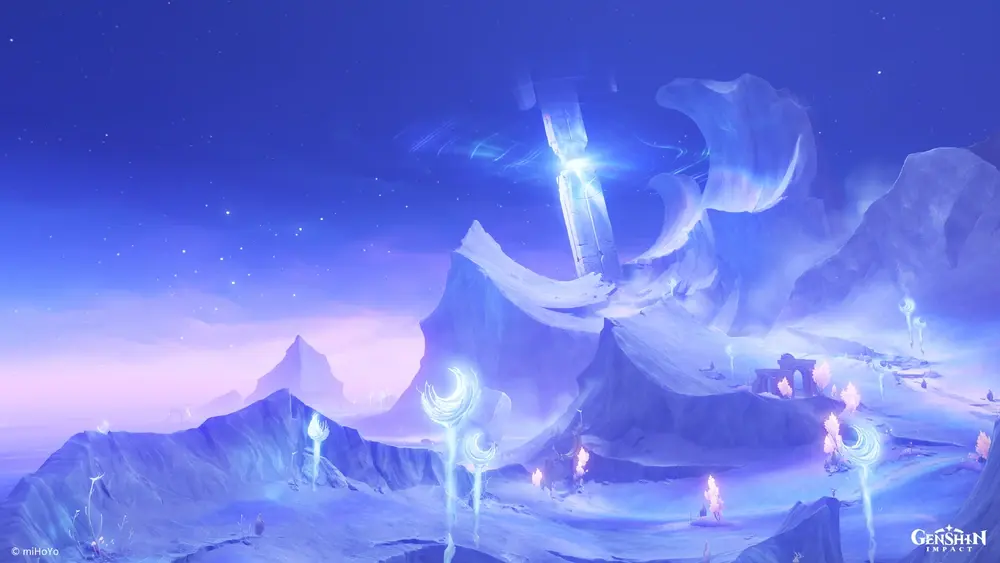
Hiisi Island by Night Glow
Nod-KraiNightCrispUncannyVast

Hiisi Island by Night Glow

Palette

Click a swatch to copy its HEX; hover for the OKLCH value.

Reconstructed gradient

The gradient distilled from the scene, unrolled left to right by stop; the authored angle is 195° (used by the hero and exports), while gallery cards share a uniform 135° sweep.

0%95a7fd36%938cf368%5d6ee7100%3848c1

Why it works

White is the most expensive colour here: 98.5% of pixels sit above chroma 0.05 at a median of 0.175, the whole frame holds a single hue (87% within 270°–315°) — and anything near white is rationed strictly to the brightest group of pixels, which is to say to the light sources themselves.

01

One hue fills an entire picture

The violet band covers 87.0% (mean 276°) and the blue band 11.9% (264°) — twelve degrees apart, in practice one family. The median chroma of 0.175 is more than double a pastel like Watatsumi's (0.05–0.11). Watatsumi shuts every colour into the bright, unsaturated corner; this shuts them into a different one, mid-lightness and high chroma. The two prove the same thing: character comes from which block of the colour space you lock the palette into, not from which hues you picked.

02

White goes to the light sources only

The frame's brightest four thousand pixels average L 0.96 and fall to chroma 0.020–0.031 — genuinely near white. Every one of them sits on a glowing plant or the beam, measured at cores around (0.45, 0.72), (0.57, 0.32) and (0.85, 0.73). The remaining 98.5% never fall below chroma 0.05. That is the discipline of a saturated single-hue scene: white is not forbidden, it is rationed, and once it is spent on the light it cannot be spent anywhere else without shooting a hole through the key.

03

The snow is not white, it is violet

The lit snow slope in the left foreground measures L 0.69, chroma 0.149, hue 285°; the far ridge on the right, L 0.75, chroma 0.125, 274° — both stay firmly in the violet family, not far off the frame's median chroma of 0.175. Snow, mist and rock: not one of them keeps its own local colour. The shortest route to a unified atmosphere is not stacking a filter layer, it is making every material hand its hue over and keep only its lightness.

Take these colours with you

CSS variables, a Tailwind v4 theme or SVG — one click to copy into your project.

/* Hiisi Island by Night Glow · Hiisi Island by Night Glow — Teyvat Palette */
:root {
  --night-violet: oklch(0.468 0.188 271.2); /* Night Violet #3848c1 */
  --frost-slope: oklch(0.69 0.149 285); /* Frost Slope Violet #938cf3 */
  --snow-ridge: oklch(0.75 0.125 274); /* Snow Ridge #95a7fd */
  --spirit-white: oklch(0.96 0.025 225); /* Spirit White #e1f6ff */
  --faint-ember: oklch(0.9 0.066 317); /* Faint Ember #f0d1fc */
  --gradient-hiisi-island: linear-gradient(195deg, oklch(0.75 0.125 274) 0%, oklch(0.69 0.149 285) 36%, oklch(0.589 0.182 273.5) 68%, oklch(0.468 0.188 271.2) 100%);
}

A 1080×1350 PNG carrying the scene, its palette and every value — save it and post it as is.